Web Design Project
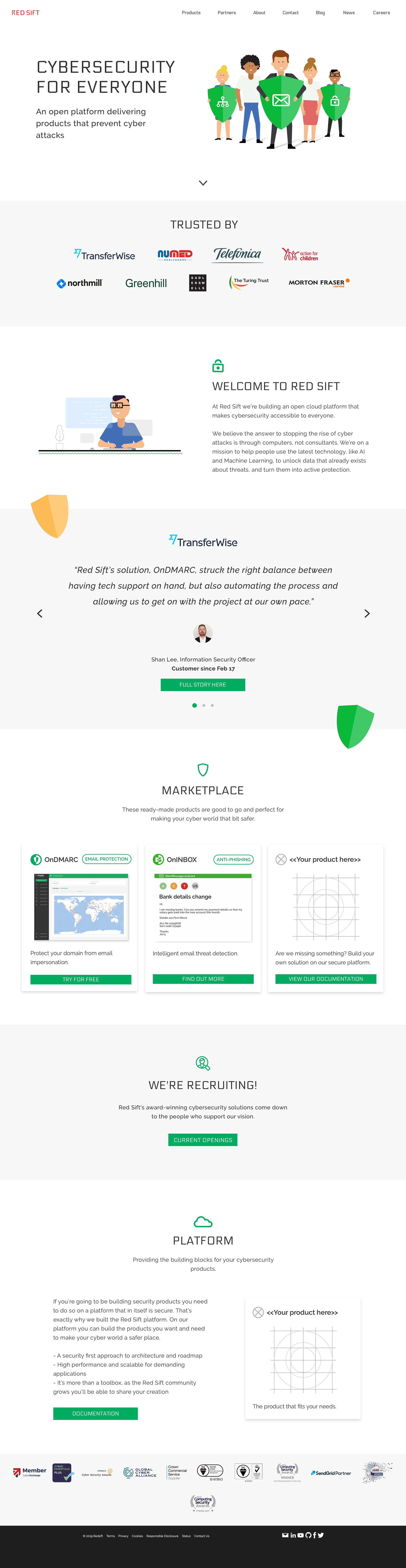
When I joined Red Sift, the long term vision of the company was to provide a platform of products that all worked together to help businesses improve their cybersecurity. However, the platform did not yet have multiple products on the platform, resulting in a corporate website identity aimed at investors/partners, and separate websites for the two products which existed.
Inspired by existing illustrations of cartoon people, I designed new product websites which further highlighted the products capabilities. However with information on separate domains, the company was being inefficient with their Adwords spending, SEO traffic was under-utilised affecting signups and customers were confused about the brand's identity.
I was responsible alongside a small team to implement a website redesign. The project aims were as follows:
- Maintain existing typefaces and create a unique set of illustrations using a consistent design style to support often abstract ideas, appealing to enterprise clients.
- Improve signup conversion rates through clearer Call-To-Actions and simplify user journeys.
- Differentiate the brand from competitors within the industry space, who often use negative terminology (ie. hackers) and dark colours to represent fear. A clean, fresh colour palette was required that still made references to the product colours (mostly greens) whilst highlighting the company red brand colour.
- Begin to bring in animated features to support user engagement.
Old Product and Comany Homepage Hero Banners
Old Company Homepage
New Company Homepage